How to pick hues that grab attention, trigger emotion, and drive action (with practical tips you can use today).
Color isn’t just decoration — it’s a silent salesperson. In flyer design, the right color choices speed up comprehension, shape emotional reactions, and make calls-to-action (CTAs) pop. Below I’ll walk you through the science-backed reasons color matters, how different hues tend to perform, cultural caveats, and a step-by-step checklist to design flyers that actually work.
Why Color Matters
People form quick judgments about visual material, and color is one of the fastest signals the brain processes. Studies show that up to 90% of snap product judgments can be based on color alone. It doesn’t just decorate; it dictates attention, perception, and even behavior. In marketing, the right color choices have been tied to higher engagement and stronger conversion rates.
For example, research highlights that contrast can dramatically impact whether a CTA is noticed and clicked. Adobe’s design guidelines emphasize the power of contrasting accents to increase conversions, while psychological studies confirm that viewers form strong emotional associations with different hues. The conclusion? Color has measurable effects on how audiences respond to a flyer.
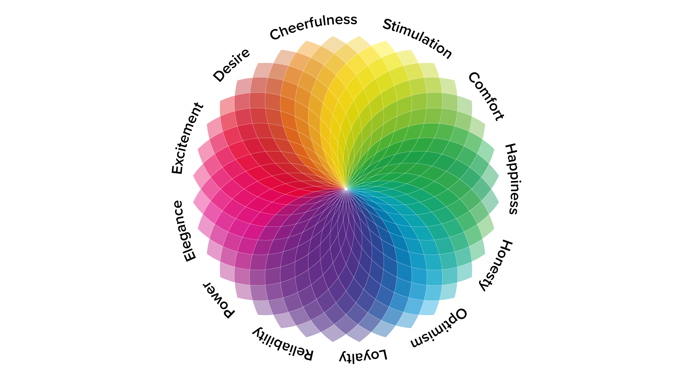
What Different Colors Communicate
Each color brings its own set of emotional triggers, and smart flyer design uses this to reinforce the flyer’s goal. Blue, for instance, is consistently linked with trust, professionalism, and calmness, making it ideal for finance, healthcare, or educational flyers. Red, on the other hand, signals urgency, passion, and excitement — which is why you’ll see it dominate sales promotions or restaurant advertising.
Green is commonly used in wellness, eco-friendly, or organic-focused campaigns because of its ties to nature and growth. Yellow and orange create energy, fun, and optimism, making them perfect for children’s events or upbeat seasonal sales. Darker tones like black and gray suggest sophistication and luxury but can become heavy if overused.
The important thing isn’t to follow a formula but to understand the emotional undertone each color carries and align it with your flyer’s purpose.
Color and Hierarchy: Guiding the Eye
A flyer’s main job is to lead the eye from the headline to supporting details and finally to the call-to-action. Color helps you build that hierarchy. The best approach is to stick with a simple palette of two or three colors. Use one dominant background shade, a supporting secondary color for balance, and a strong accent that draws attention to your most important message.
The accent should be reserved for CTAs, discounts, or event details that absolutely need to stand out. For example, if your flyer is mostly soft greens and neutrals, a bright orange button or callout can make the event registration link impossible to miss. Designers also recommend testing legibility — if text or CTAs don’t stand out in both color and contrast, they should be adjusted before printing.
Cultural Nuances You Shouldn’t Overlook
While color associations may seem straightforward, meanings shift depending on cultural context. White, for instance, conveys purity and weddings in many Western cultures but can symbolize mourning in others. Similarly, red might represent danger in one country and celebration or good fortune in another.
This means that if your flyer targets an international audience or communities with diverse cultural backgrounds, it’s worth checking how your chosen palette will be interpreted. A quick survey, or even looking at how similar organizations in your target region use color, can prevent miscommunication.
Testing Colors: A Practical Approach
The easiest way to see if your color strategy works is to test it. A simple A/B test — for example, trying two versions of the same flyer with different CTA colors — can reveal which resonates better. Many marketers also experiment with background tones, comparing warm vs. cool palettes to see which generates more interest or clicks.
Another practical step is to print the flyer in grayscale before finalizing. If the hierarchy (headline, supporting info, CTA) still makes sense without color, your design is strong. If not, it’s a sign that the palette is doing too much of the heavy lifting and the layout may need rebalancing.
Real-World Examples of Color Strategy
Consider a local store running a seasonal discount. A clean white or light-gray background allows bold red or orange accents to highlight “50% Off” and direct readers to the offer. In contrast, a wellness retreat flyer might rely on earthy greens and muted beiges to evoke relaxation, with a deeper green for the registration button.
Professional events like seminars often use blue palettes to inspire trust and credibility. Adding a warm accent, such as orange or gold, to the sign-up details helps ensure the key information doesn’t get lost in the serious tone of the design. In all these cases, the color palette matches the flyer’s objective and reinforces the message.
Using Templates to Speed Up the Process
Not everyone has the time or experience to build designs from scratch. That’s where resources like printable flyer templates can help. These templates often come with pre-designed layouts and balanced color palettes, which you can then adjust to match your brand identity or campaign goals. It saves time while ensuring that the final design is polished and professional.
A Simple Color Checklist Before Printing
When you’re close to finalizing your flyer, run through this quick check:
- Does your CTA stand out clearly against the background?
- Is your palette limited to two or three strong colors plus neutrals?
If you can confidently say yes to both, you’re already ahead of most casual flyer designs.
Closing Thought
Color is one of the most powerful tools in flyer design, not because it makes designs “prettier” but because it directs attention, shapes emotion, and inspires action. By choosing hues strategically, testing for contrast and cultural fit, and keeping palettes simple, you can create flyers that don’t just get noticed — they get results.